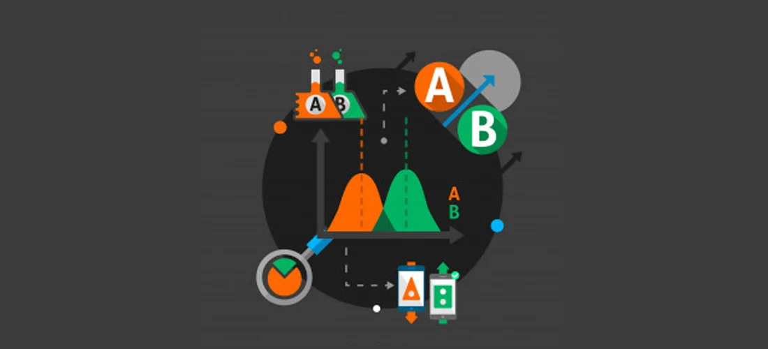
Online customer acquisition is challenging and competitive. The average conversion rate of an eCommerce website in 2020 is ~2.86%. It’s evident that if you can increase your conversion rate by 2%, you can double your revenue. Marketers are yet to figure out a rule of thumb when it comes to CRO (Conversion rate optimisation). But domains like cognitive marketing, AI-powered eCommerce, user experience management, website analytics and website testing have been used to increase conversions. This article will focus on how testing can improve conversions.
Assume that you have a fully functioning website, what does it take for a visitor to search a product, add the product to the cart, trust you with their credit card details, proceed to a checkout and to revisit your site again? All of these decisions are subjective and the slightest change to your website architecture will increase or decrease the likelihood of those decisions. Testing helps you to understand the current state of your website and the effect of a slight change. In 2004, Google did such a test and it became famous. Google wanted to know if the colour blue on their search ads had a significant impact on the click-through rate. They ran a multivariate test to check this hypothesis. They picked 50 different shades of blue and showed them each to 1% of their visitors as their search ad results. They then picked the most engaging blue colour . This slight change of colour resulted in a $200M increase in their ad revenue.

Out of all the elements that can be tested and tweaked, it's important to understand which elements matter most. Understanding the significance will help you to prioritise your testing calendar. In this section, we can recommend a few variants that could work for each web element, but it’s important to test them in your eCommerce environment.
This is the first impression that users get about your website. You need to make sure that these pages perform well. Testing and optimising the page load speed to meet industry standards (1-3 seconds) is critical. The page should give a clear direction for visitors that pushes them closer to a conversation. Simplified and easy to find navigations, personalised landing pages according to different demographics and geographical locations are key, as is placing your call to actions and promotions on hot spots (according to heat map results) can improve conversations.
Eg - using personalised landing pages based on the state that the user is in vs. a single landing page Australia wide.
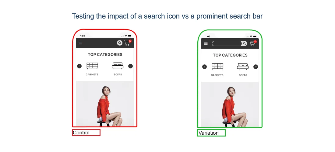
It must be easier for customers to find what they are looking for. Your search icon needs to have a prominent place on each page. Search results should be presented in a way that customers can easily scroll through and find what they are looking for.
Once a visitor lands on a product page, you need to understand what information would convince them to add that product to the cart. There is unlimited info you can offer, but you have limited space and a limited time (users attention span) . Below are examples of the types of strategies that you could run. To determine what’s most effective for your business, you can split test these strategies:
| Variation | Example |
| Create urgency | Time based promotions. |
| Create scarcity |
Number of items left, number of sales made within the last 24h. |
| Use different CTA’s |
Testing different call to actions like Add to cart vs Add to bag. |
| Use social proof |
Product rating & customer reviews. |
| Visual presentation of the product | Single picture at a time vs an image grid. |
| Product recommendations and cross-selling | Featured products vs recommended products. |
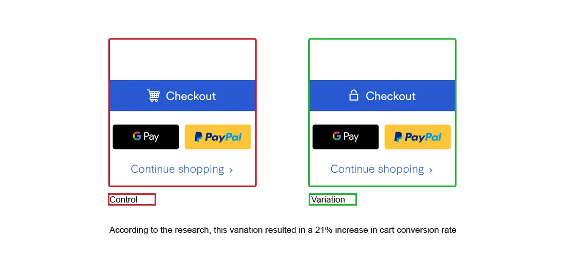
Cart and checkout should be a high priority because the average eCommerce shopping cart abandonment rate is high at ~71%. You should even consider the possibility of reworking your checkout process according to market demand. Currently customers:
All of the above are hypotheses based on current market demand and are worth testing.
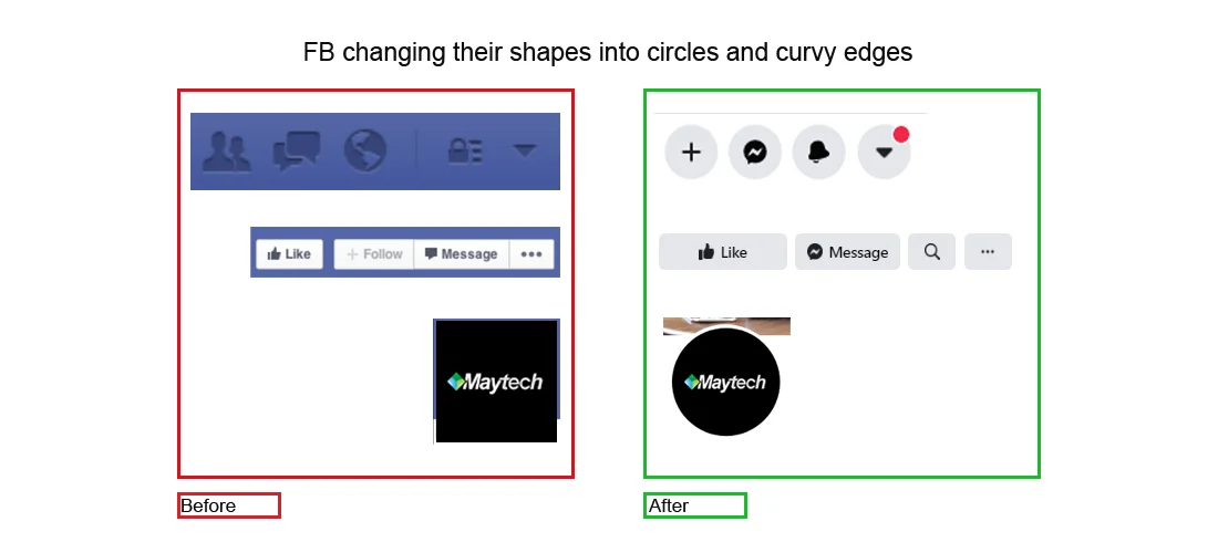
The slightest change to the shape, colours or font of your call to action button(s) can impact your engagement. There is ample 3rd party research data that explains consumer behaviour and their reactions to different colors, shapes and words. Finding such inspirations and testing them on your website is important. For example, when Facebook found that people are more attracted to circles than squares and rectangles, they changed their entire design to replace as many squares as possible with circles. We all agree that FB is addictive, but it's not just the content and concept. Their designs are tested to drive conversions and form habits.
It’s important to find the happy medium between asking too little and too many questions. Most visitors stop submitting forms due to their length and complexity. It’s important to test simplified versions of your forms to improve the submission ratio. You can run tests to figure out if auto-filling information, checklist and dropdowns assists users to complete forms.
Data-driven designs are important to enhance conversions. A test and tweak culture can positively impact any marketing campaign ranging from a word choice in a fart abandonment email to a colour change in your brand logo. Prioritise testing on your design and online marketing strategy must be the way forward. With our experience in eCommerce development, Maytech can help you to plan and execute a strategic roadmap for testing and conversion rate optimisation.
We are an Australian based software development company that specialises in bespoke web and mobile application development, eCommerce solutions, process automation and staff augmentation. If you find this content relevant, we are sure that we can help you improve the way you do business. Contact us to find out how our technical expertise and 16 years of industry experience can deliver results for your business.
Reach out today for an obligation free conversations.